Decorating with bold colors can transform your space into something lively, expressive, and full of personality. But without the right strategy, it can easily become overwhelming.
Here’s how to use bold colors effectively while maintaining balance, harmony, and style.
Start With a Neutral Foundation
A neutral base helps bold colors stand out without overpowering the room.
- Walls in shades like white, beige, gray, or soft taupe act as a calming backdrop.
- Floors, large furniture pieces, or ceilings in neutral tones ground the design.
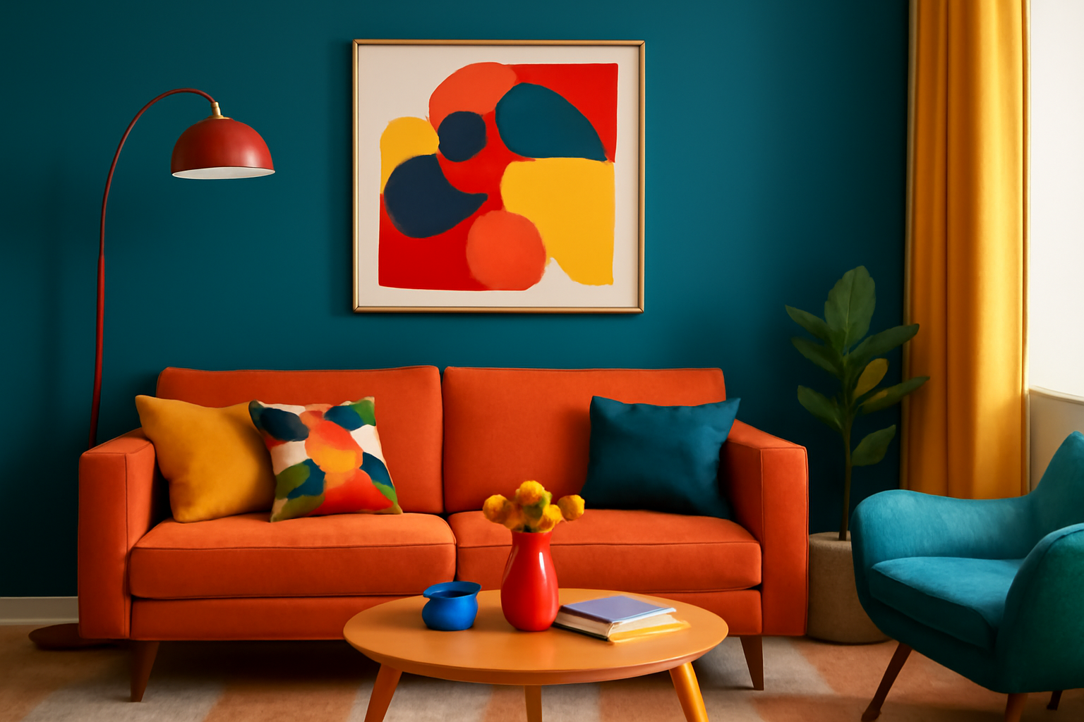
Use Bold Colors as Accents
Incorporate bold hues through accessories and smaller elements:
- Throw pillows
- Rugs
- Artwork
- Lamps
- Curtains
- Decorative objects
This lets you enjoy vibrant colors without them dominating the space.
Choose a Color Palette
Stick to a cohesive color scheme to avoid chaos:
- Select one main bold color and pair it with 1-2 complementary colors.
- Use the 60-30-10 rule: 60% neutral, 30% secondary color, 10% bold accent.
Example:
- Neutral: White walls and sofa (60%)
- Secondary: Navy rug and chairs (30%)
- Bold: Mustard yellow throw pillows and vases (10%)
Use Bold Furniture as a Statement
A colorful sofa, chair, or cabinet can become the centerpiece:
- Pair it with neutral surroundings to let it shine.
- Avoid adding multiple bold furniture pieces in the same room unless they’re coordinated.
Balance With Texture and Materials
Balance bright colors with calming textures:
- Combine bold velvet cushions with linen curtains.
- Pair vibrant ceramics with natural wood or stone elements.
- Mix glossy finishes (like lacquer) with matte surfaces to tone down intensity.
Limit the Number of Bold Colors
Too many strong colors compete for attention:
- Stick to one or two bold colors per room.
- Let them repeat in different areas for cohesion (e.g., a teal cushion, teal artwork, and a teal lamp).
Try Bold Walls — With Caution
Painting a wall a bold color works if:
- It’s an accent wall, not the entire room.
- It’s balanced by neutral furniture and decor.
- You choose a deep tone like navy, emerald, or charcoal that feels sophisticated rather than loud.
Use Bold Patterns Wisely
Patterns amplify the impact of color:
- Use patterned rugs, curtains, or cushions in bold tones.
- Balance busy patterns with solid, neutral surfaces.
Play With Color Blocking
Color blocking can be trendy and sophisticated:
- Paint half the wall in a bold shade and the other half neutral.
- Use bold-colored cabinets against neutral walls for kitchens or bathrooms.
Add Natural Elements to Ground the Space
Nature balances vibrancy:
- Wooden furniture
- Woven baskets
- Green plants
- Stone accessories
These elements tone down bold colors and add warmth.
Don’t Forget Lighting
Bold colors can look different under various lighting:
- Test paint or fabrics in natural and artificial light before committing.
- Use warm-toned bulbs to soften the intensity of bright colors.
Common Mistakes to Avoid
- Overusing bold colors: Leads to visual fatigue.
- Ignoring balance: Bold walls + bold furniture + bold patterns = overwhelming.
- No cohesive palette: Random bright colors feel chaotic.
- Neglecting neutrals: They’re essential for balance.
Final Thoughts
Bold colors are a powerful tool in home design. When used thoughtfully, they add energy, creativity, and personality to your space. Stick to a balanced color palette, mix with neutrals, and use bold hues strategically to create rooms that feel vibrant, not chaotic.