Color plays a central role in home decoration. It can uplift, calm, energize, or even overwhelm a room. Knowing how to combine colors effectively can make your space look cohesive, stylish, and comfortable without feeling chaotic or overdone. In this guide, you’ll learn practical tips to blend colors beautifully and confidently in your home.
The Psychology Behind Color Choices
Before choosing color combinations, it’s important to understand the emotions different colors can evoke:
- Blue: Calm, serenity, trust.
- Green: Nature, growth, tranquility.
- Yellow: Optimism, energy, warmth.
- Red: Passion, power, stimulation.
- Neutrals (white, gray, beige): Balance, cleanliness, sophistication.
This emotional impact should guide your palette, depending on what mood you want to create in each room.
Start With a Base Color
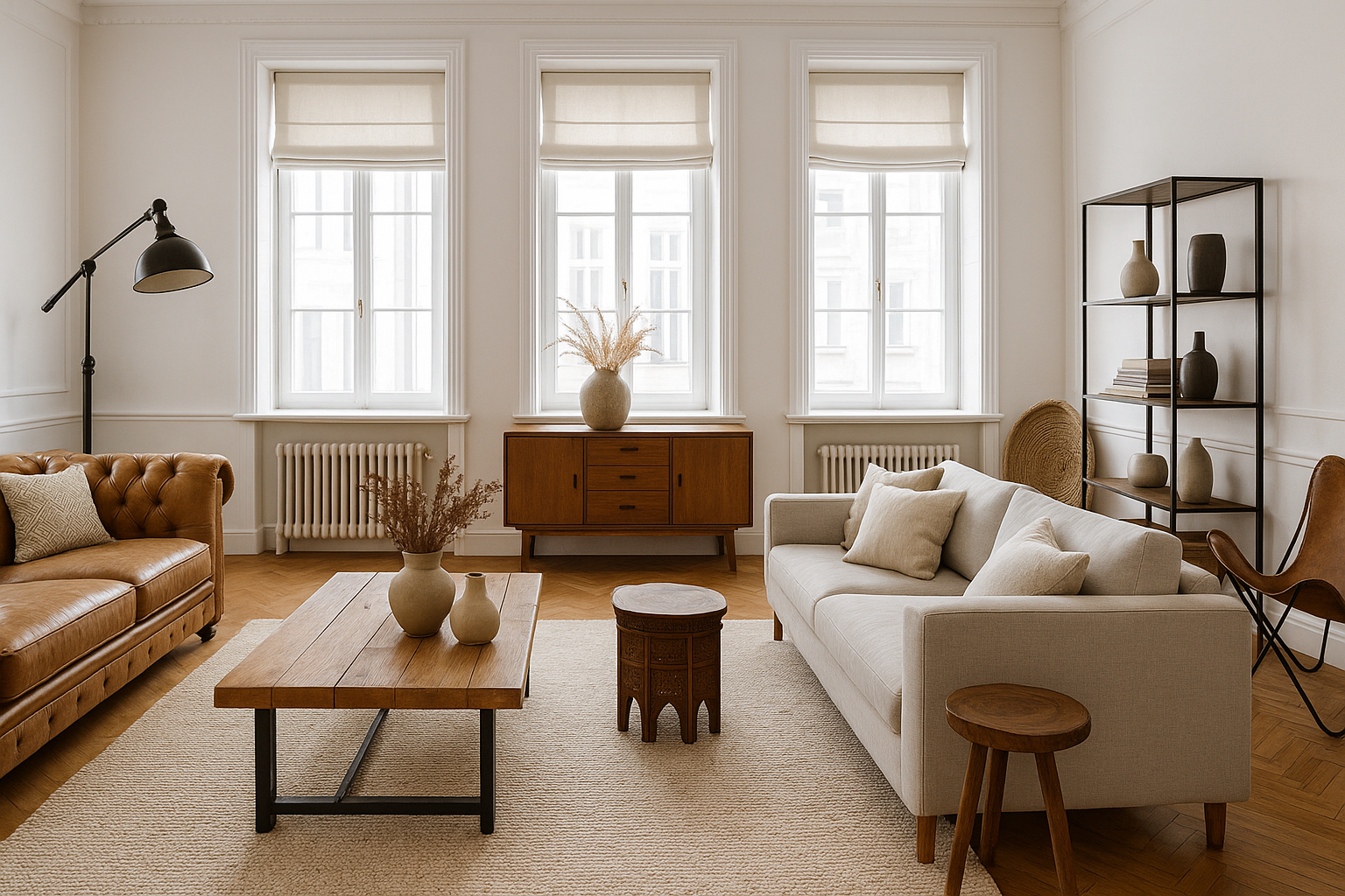
Every color scheme needs an anchor. Choose a base color that sets the tone for the room. This is typically a neutral, such as white, beige, gray, or soft taupe. A neutral base provides flexibility and keeps the space from feeling too busy.
Use this color for the walls, larger furniture, or floors. From here, you’ll layer other tones for contrast and personality.
Use the 60-30-10 Rule
A tried-and-true formula in interior design, the 60-30-10 rule helps maintain balance:
- 60% – Dominant color (walls, large rugs, sofas)
- 30% – Secondary color (curtains, accent chairs, furniture)
- 10% – Accent color (pillows, artwork, vases)
This rule prevents overpowering the senses and gives the room a pleasing sense of harmony.
Choose a Color Palette That Matches Your Style
Depending on your style preference, here are some common palettes:
- Monochromatic: Various shades of a single color (e.g., navy, sky blue, baby blue)
- Analogous: Colors next to each other on the color wheel (e.g., blue, green, teal)
- Complementary: Opposite colors on the wheel (e.g., blue and orange, red and green)
- Triadic: Three evenly spaced colors (e.g., red, yellow, blue)
Each palette creates a different vibe—from soothing to vibrant.
Limit the Number of Bold Colors
While bold colors add drama and personality, using too many can feel overwhelming. Stick to one or two vibrant tones per room. Use them in smaller elements—such as throws, lamps, or art pieces—so they pop without dominating.
For example, a navy blue sofa can be balanced with cream walls and gold accessories.
Use Neutrals to Ground Your Design
Neutral tones provide rest for the eyes and act as a bridge between other hues. They’re essential for breaking up intense color combinations.
Pairing bright yellow with a soft gray or beige allows both tones to shine without clashing. Neutrals also help create a timeless look that’s easy to update with seasonal trends.
Consider Light and Room Size
Color looks different depending on the amount of natural light and room dimensions:
- Small rooms: Lighter colors (off-white, soft pastels) make the space feel bigger and airier.
- Large rooms: Darker tones can add warmth and coziness.
- Low-light rooms: Warm tones (cream, peach, terracotta) make the space feel inviting.
- Well-lit rooms: Cool tones (blue, sage, charcoal) look sharp and clean.
Test paint swatches at different times of day before committing.
Add Texture to Complement Color
Color isn’t just about paint—it lives in fabric, wood, stone, and metals. Textures add depth and keep monochromatic or neutral palettes from feeling flat.
Combine velvet cushions, wooden furniture, woven baskets, and glass vases to create a layered, lived-in look.
Patterns Need Balance
When using multiple patterns—floral, stripes, geometrics—make sure they share a common color. This ties them together visually. Keep pattern sizes varied: mix large-scale prints with small ones, and pair complex patterns with solids.
If you use a bold patterned rug, choose solid-colored furniture. If your couch has a pattern, keep the walls simple.
Don’t Forget the Ceiling and Floor
People often overlook the “fifth and sixth walls”: the ceiling and floor. These areas can either add contrast or stay neutral to let other elements shine.
- Ceilings: Painting them a lighter tone than the walls can make the room feel taller.
- Floors: Rugs offer a chance to introduce or reinforce your color palette.
Use Color to Define Zones
In open-plan homes, use color to visually separate areas. For example, paint the dining area in a deep navy to give it intimacy, while keeping the living area light and airy.
This zoning technique helps organize the space without physical barriers.
Final Thoughts: Confident Color Choices
Combining colors in home decor doesn’t have to be intimidating. Start with a neutral base, apply the 60-30-10 rule, and introduce accent shades carefully. Think about the mood you want to create, consider the natural light, and layer with textures and patterns for depth.
With a thoughtful approach, you can create spaces that are vibrant, balanced, and uniquely yours.