Small spaces can be cozy, efficient, and beautifully designed—but they also pose a few decorating challenges. One of the most powerful tools in your design toolkit? Color. The right paint colors and decor choices can make even the tiniest room feel more spacious, airy, and inviting.
In this article, we’ll explore the best colors for opening up small rooms, as well as smart tips for using them effectively in furniture, walls, and accessories.
Why Color Matters in Small Spaces
Color affects how we perceive space. Lighter tones tend to reflect light, making walls seem to recede, which visually expands a room. Darker shades, on the other hand, can make a space feel cozy but risk closing it in if not used carefully.
But it’s not just about light versus dark—contrast, saturation, and the overall color scheme also play big roles in spatial perception.
1. Crisp White for a Clean Canvas
White is a classic choice for small spaces—and for good reason. It reflects light, creates a sense of openness, and allows other elements in the room to stand out.
How to Use:
- Paint walls, ceilings, and trim the same shade of white to eliminate visual boundaries.
- Choose off-whites (like eggshell or cream) if you want a softer, warmer look.
- Pair with wood or natural textures for warmth and character.
White also allows more flexibility with furniture and accessory colors, making it easy to switch styles over time.
2. Light Gray for a Sophisticated Feel
Gray offers the brightness of white with added depth. A pale gray can feel calm, modern, and expansive all at once.
Best for:
- Living rooms or bedrooms where you want a serene atmosphere.
- Spaces with a lot of natural light, as gray can turn cool in darker rooms.
Pair with whites, soft wood tones, and subtle metallics like brushed brass or chrome.
3. Soft Pastels for Subtle Color
Pastels like blush pink, pale blue, lavender, and mint green are excellent for small spaces. They add a touch of personality while still reflecting plenty of light.
Tips:
- Use pastel walls with white or neutral furniture to maintain airiness.
- Try two-tone walls, with white on the bottom and pastel above.
- Keep decor minimal to let the color shine.
These shades are especially effective in bathrooms, nurseries, or lighthearted kitchens.
4. Cool Blues to Create Depth
Cool colors like sky blue, soft turquoise, or icy aqua can make a room feel breezier and larger.
How It Works:
Cool colors tend to recede visually, giving the illusion that walls are farther away than they are.
Use them in combination with crisp white trim and minimalist decor for a fresh and open look.
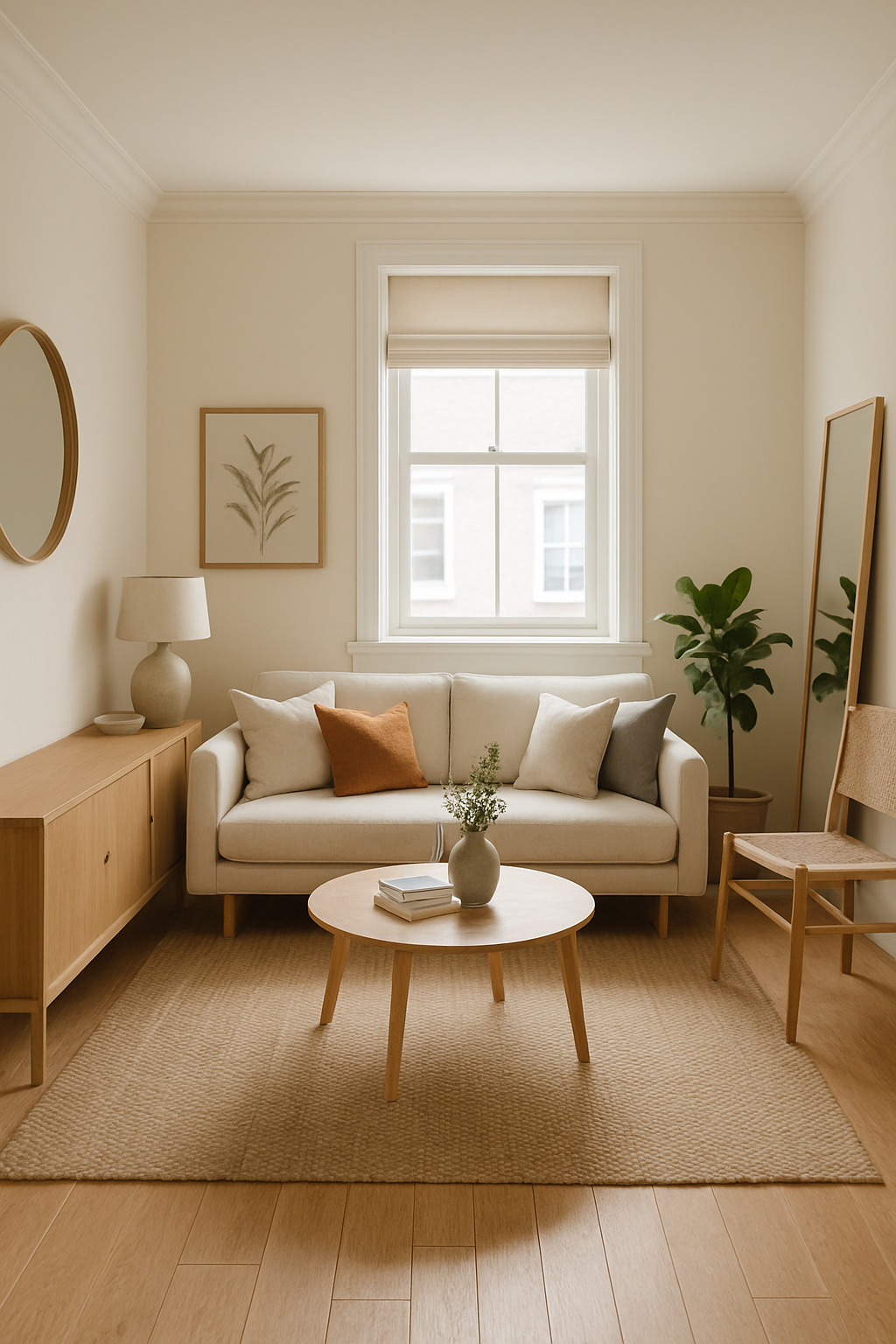
5. Neutral Beiges and Taupes for Warmth
Not a fan of white? Go for warm neutrals like beige, tan, or taupe. These colors provide a grounding warmth while still keeping the space light.
Suggestions:
- Match wall color to floor tone for a seamless, unbroken look.
- Layer with similar tones in furniture and rugs.
- Avoid high contrast, which can create visual breaks and make a space feel smaller.
6. Vertical or Horizontal Color Tricks
It’s not just about which color you use—but how you use it. Try these painting strategies to expand space visually:
- Vertical stripes: Make ceilings feel higher.
- Horizontal stripes: Make narrow rooms seem wider.
- Lighter ceiling color: Makes the room feel taller.
- Color blocking: Use a darker tone on the lower half of the wall to ground the space and light on top to open it up.
These techniques work best in small living rooms, bathrooms, or hallways.
7. Low-Contrast Color Schemes
High-contrast color palettes (e.g., black and white) can break up a space visually. In small rooms, try a low-contrast scheme instead:
- Choose different tones within the same color family.
- Match wall and furniture colors to blend boundaries.
- Add texture instead of color contrast to keep it interesting.
This creates a smoother visual flow and makes the room feel unified and spacious.
8. Reflective Surfaces and Gloss Finishes
Paint sheen also plays a role in how a room feels.
- Eggshell or satin finishes bounce more light around the room than matte finishes.
- Glossy tiles or lacquered furniture can enhance the effect.
- Combine with mirrors or metallic accents to amplify brightness.
However, don’t overdo the shine—too much can look sterile. Use reflective elements selectively.
9. Accent Walls in the Right Places
While bold accent walls can sometimes overwhelm a small room, when done right, they can create depth and focus.
Do:
- Paint the wall behind your bed or sofa in a rich but soft tone like sage green or deep blue.
- Use darker shades only on one wall, with lighter tones elsewhere.
- Add wall art, sconces, or shelves to enhance the focal effect.
This adds character without closing in the space.
10. Monochromatic Rooms with a Twist
One of the most effective tricks for small space design is a monochromatic palette—using variations of one color throughout.
Example:
- Soft gray walls, a charcoal sofa, silver accents, and light gray curtains.
- Pale beige walls, tan rug, light wood furniture, and cream accessories.
This cohesive color story avoids harsh lines and makes the room feel seamless and expansive.
The Right Color Makes All the Difference
Decorating a small space doesn’t mean sacrificing style—it just requires smarter choices. By using light-reflective colors, minimizing visual contrast, and playing with finishes and techniques, you can transform even the smallest room into a bright and open retreat.
Whether you lean toward soft pastels, earthy neutrals, or classic white, choose a palette that reflects your personality while enhancing your space. With thoughtful color design, even the coziest corners can feel spacious and serene.