Color has the power to influence how we feel, think, and interact within a space. In interior design, understanding color psychology means more than just choosing pretty shades—it’s about using color to create an emotional experience that supports the purpose of each room.
Whether you want to design a calming bedroom, an energizing office, or a welcoming living area, this guide will show you how to use color psychology to transform your space with intention.
What Is Color Psychology?
Color psychology is the study of how colors affect human behavior and emotions. In design, it helps create environments that promote mood, function, and energy aligned with the room’s purpose.
While reactions to color can be personal and cultural, there are common emotional associations that can guide your choices.
Let’s explore what those colors are—and how to use them at home.
Blue – Calm, Focus, Serenity
Blue is one of the most universally liked colors. It evokes peace, stability, and clarity. Lighter blues feel airy and tranquil, while darker blues bring sophistication and depth.
Best for:
- Bedrooms (for relaxation)
- Bathrooms (for a spa-like feel)
- Home offices (to improve focus)
Design tips:
- Pair soft blues with white or beige for a coastal vibe.
- Use navy blue in accent walls for boldness without overwhelming the space.
- Add natural wood or brass finishes to warm up cooler blue tones.
Green – Balance, Renewal, Freshness
Green is associated with nature and symbolizes growth, health, and harmony. It’s a restful color that helps bring the outdoors in.
Best for:
- Living rooms (for a relaxed social environment)
- Kitchens (to stimulate appetite and freshness)
- Home libraries or offices (to reduce stress)
Design tips:
- Use sage or olive green for a modern, earthy feel.
- Pair emerald green with gold or marble for a luxurious effect.
- Bring in green through plants, fabrics, or painted cabinetry.
Yellow – Optimism, Warmth, Energy
Yellow is cheerful and stimulating. It brings sunshine into your home—even on cloudy days. Use it to energize and uplift the space.
Best for:
- Kitchens or breakfast nooks (to start the day with brightness)
- Entryways or hallways (to welcome guests)
- Creative spaces (to boost mental stimulation)
Design tips:
- Use soft buttery yellows for a cozy cottage feel.
- Pair mustard yellow with gray, navy, or black for sophistication.
- Avoid overly bright yellows in large doses—they can be overstimulating.
Red – Passion, Excitement, Confidence
Red is bold and intense. It stimulates conversation, appetite, and energy, but should be used thoughtfully.
Best for:
- Dining rooms (to encourage appetite and engagement)
- Accent walls in living spaces (to add drama)
- Small details in kitchens or offices (for energy boosts)
Design tips:
- Use brick or rust red for a more grounded feel.
- Combine with neutrals like white, beige, or gray to balance intensity.
- Try red in artwork, rugs, or small decor instead of full walls.
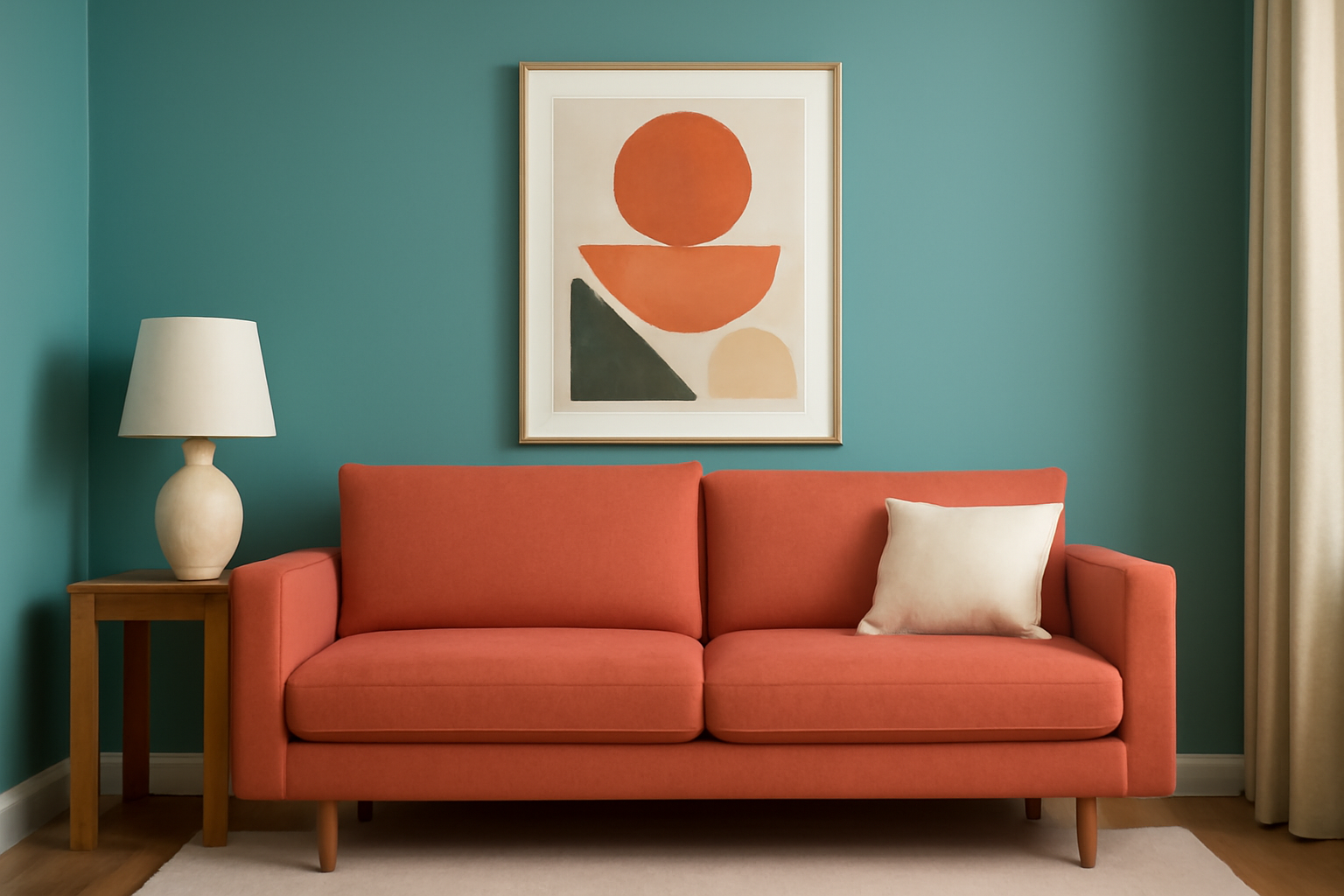
Orange – Vitality, Creativity, Warmth
Orange combines the passion of red and the optimism of yellow. It’s friendly, playful, and invigorating.
Best for:
- Playrooms or craft rooms (to inspire creativity)
- Workout rooms (to boost energy)
- Kitchens or dining areas (to create warmth)
Design tips:
- Use terracotta or burnt orange for a more sophisticated, earthy look.
- Combine with cream or deep blue for contrast.
- Use sparingly—orange can dominate if overused.
Purple – Luxury, Creativity, Mystery
Purple is traditionally associated with royalty and creativity. Lighter purples like lavender feel soothing, while deeper purples add richness and drama.
Best for:
- Bedrooms or meditation spaces (lavender tones for calm)
- Reading nooks (to inspire imagination)
- Dining rooms (to create elegance)
Design tips:
- Mix lavender with gray, white, or silver for a dreamy palette.
- Use eggplant or plum on accent walls or textiles for a luxe vibe.
- Pair with gold accents for high-impact glamour.
Pink – Comfort, Romance, Gentleness
Pink is soft, nurturing, and emotionally warm. Depending on the shade, it can feel modern or nostalgic.
Best for:
- Bedrooms (especially children’s or guest rooms)
- Living rooms (for a contemporary, feminine touch)
- Bathrooms (to add charm and softness)
Design tips:
- Blush pink pairs well with muted tones like sage, charcoal, or cream.
- Dusty rose works beautifully with gold, wood, or navy.
- Avoid neon pinks in large amounts unless you want a bold, retro look.
White – Cleanliness, Openness, Simplicity
White represents clarity, peace, and minimalism. It reflects light and creates a feeling of space and purity.
Best for:
- Any room where you want to feel calm, open, and clean.
- Kitchens and bathrooms (to emphasize hygiene)
- Small rooms (to visually expand space)
Design tips:
- Use warm whites in cozy spaces and cool whites in modern ones.
- Layer with texture (linen, wood, ceramic) to avoid feeling sterile.
- Add pops of color with artwork or textiles to bring life to white rooms.
Gray – Sophistication, Balance, Neutrality
Gray is elegant, flexible, and calming. It works well as a background color and pairs beautifully with both bold and soft tones.
Best for:
- Living rooms or bedrooms (as a neutral base)
- Offices (to promote concentration)
- Bathrooms (for a modern, spa-like feel)
Design tips:
- Use lighter grays for a soft, airy look.
- Combine charcoal gray with metallics for drama.
- Layer different shades of gray with textures for depth.
Black – Depth, Drama, Elegance
Black adds boldness and sophistication. While it can feel heavy, it adds contrast and definition when used correctly.
Best for:
- Accent walls
- Statement furniture or lighting
- Framing windows, doors, or artwork
Design tips:
- Use sparingly to avoid making the room feel closed in.
- Pair with white or metallic finishes for contrast.
- Use black in matte finishes for a softer effect.
Use Color Zones to Define Purpose
Color psychology isn’t limited to single-room design—you can use it to zone spaces in open layouts or multifunctional rooms.
Examples:
- Use energizing colors (like yellow or coral) in work areas.
- Use calming colors (like green or blue) in lounge or sleep zones.
- Use dark or moody tones in reading nooks or media corners.
Color becomes a tool not just for beauty—but for function and emotional flow.
Let Color Work for You
Color psychology allows you to design a home that doesn’t just look good—it feels right. By understanding how each color affects mood and energy, you can make more intentional design choices that support your well-being and lifestyle.
Trust your instincts, experiment with palettes, and don’t be afraid to step outside your comfort zone. When used wisely, color becomes one of the most powerful tools in your interior design toolkit.