Neutral colors are often associated with calm, clean, and timeless design—but they can also be misunderstood as dull or lifeless. The truth is, when used correctly, neutral palettes can create some of the most elegant and inviting spaces. The key lies in variety, texture, and intentional styling.
Here’s how to use neutral colors in your home decor without making your space feel bland or boring.
Understand What “Neutral” Really Means
Neutral colors go beyond just white and beige. They include a wide spectrum of shades that pair well with other colors and don’t dominate the room.
Common neutrals include:
- White and off-white
- Beige, taupe, and tan
- Gray and greige (gray + beige)
- Cream and ivory
- Soft browns and mushroom tones
- Muted blacks and charcoals
These colors can act as a backdrop or the main attraction—depending on how you use them.
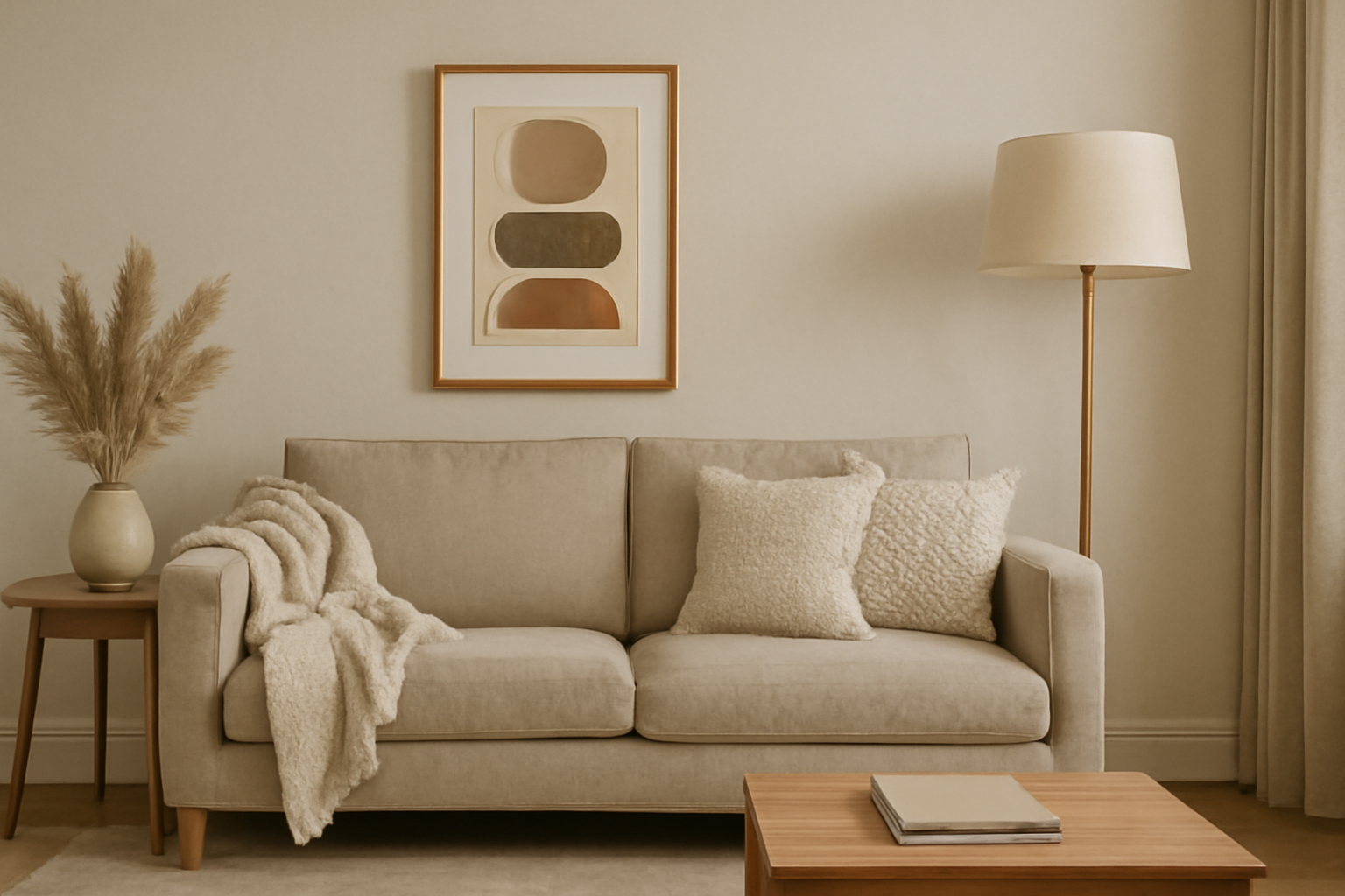
Layer Different Shades of Neutrals
Using a single neutral shade throughout a room can feel flat. The trick is to layer multiple tones within the same neutral family.
For example:
- Combine ivory walls with a beige sofa, taupe throw pillows, and a warm brown rug.
- Use varying shades of gray in textiles, furniture, and decor.
Layering creates depth and keeps the space visually interesting, even without a single bold color.
Use Texture to Create Visual Interest
When your color palette is soft and subdued, texture becomes the star. It’s what brings life and richness to a neutral space.
Ways to add texture:
- Mix soft linens, chunky knits, and smooth leathers.
- Use natural materials like wood, rattan, or stone.
- Incorporate metallic finishes in bronze, brass, or matte black for contrast.
- Add textured wallpapers, woven rugs, or pleated curtains.
This tactile variety adds depth and makes the space feel warm and cozy.
Mix Materials and Finishes
Combining different materials adds richness and layers, even if all the pieces are in similar colors.
Try this:
- Pair a velvet chair with a wooden coffee table and ceramic vases.
- Use matte walls with glossy tile accents.
- Combine glass lighting with brushed metal hardware.
The contrast between materials elevates a neutral room and keeps it from feeling one-note.
Add Warmth Through Lighting
Lighting is especially important in neutral spaces. The right lighting can enhance textures and make the room feel cozy and inviting.
Tips:
- Use warm-toned bulbs rather than cool white.
- Incorporate layered lighting: ceiling lights, table lamps, wall sconces, and floor lamps.
- Highlight architectural features or art with accent lighting.
A well-lit neutral room feels lively, not sterile.
Play with Patterns
Subtle patterns can add character without overwhelming your space.
Ideas:
- Choose neutral-patterned rugs like herringbone, Moroccan, or geometric designs.
- Add striped or plaid throw pillows in similar tones.
- Use patterned wallpaper in soft grays or taupes for visual drama.
Patterns introduce movement and rhythm, which help prevent the decor from feeling static.
Use Natural Elements for Warmth
Nature-inspired decor adds authenticity and charm to neutral spaces.
Incorporate:
- Wood furniture (especially in lighter or medium finishes)
- Stone or marble surfaces
- Woven baskets and rattan accents
- Greenery—real or faux—for a fresh touch
These organic elements bring life to the room and reinforce the calm, grounded feeling that neutral colors provide.
Include Statement Pieces
Just because you’re using a neutral palette doesn’t mean everything has to blend in. A bold piece in a neutral tone can be just as impactful as a bright-colored item.
Ideas:
- A large textured art piece in black, white, or tan
- A sculptural chair in a deep brown leather
- A dramatic light fixture in matte black or gold
- A vintage rug with muted earthy tones
Let one or two items serve as focal points to keep the room feeling curated and intentional.
Add Contrast for Depth
Contrast is essential in neutral spaces to avoid monotony.
Create contrast through:
- Light and dark shades (e.g., white walls with dark wood accents)
- Soft vs. structured shapes (e.g., a curved chair next to a square coffee table)
- Smooth and rough surfaces (e.g., polished metal next to woven linen)
These opposing elements add energy and prevent the decor from becoming flat.
Keep It Personalized
The most beautiful neutral spaces are the ones that feel lived-in and authentic.
Add personal elements like:
- Family photos in black and white
- Travel souvenirs in natural finishes
- Books with neutral-colored spines
- Art or objects that reflect your interests and taste
Neutrals make a perfect backdrop for your personality to shine through.
Elevate Simplicity with Intentional Design
Neutral decor doesn’t have to be boring—it can be serene, elegant, and deeply sophisticated. By mixing shades, playing with texture, and incorporating contrast, you create a space that’s anything but dull.
Remember: a neutral palette is not about playing it safe. It’s about creating a home that feels calm, layered, and timeless.